


Nothing fails a Lighthouse accessibility audit—or frustrates real users squinting at their phone in daylight—faster than sleek, low-contrast grey text (#9ca3af) sitting on a white or translucent glassmorphic card. Beyond user experience, WCAG 2.2 Level AA contrast compliance is now a legal requirement across the EU European Accessibility Act (EAA), US ADA / Section 508, and enterprise SaaS procurement checklists.
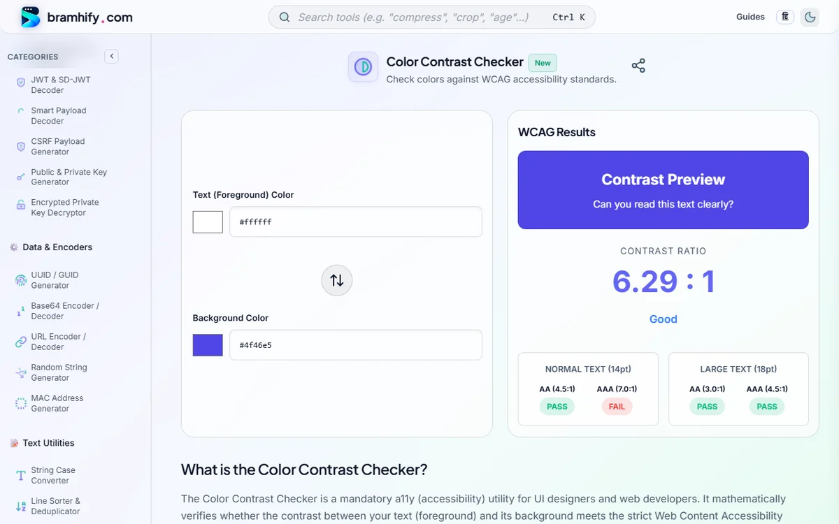
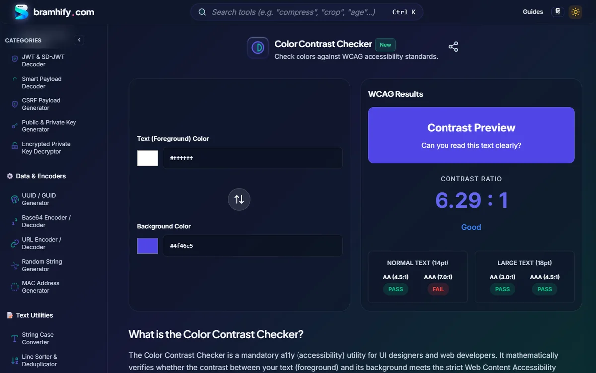
Bramhify's 100% offline Color Contrast Checker computes the exact W3C relative luminance contrast ratio (1:1 to 21:1) in real time as you type hex codes or tweak color pickers—instantly showing WCAG AA and WCAG AAA Pass/Fail badges for both Normal and Large text plus a 1-click Foreground/Background swap button.
WCAG 2.2 Contrast Ratio Requirements Cheat Sheet
| Element Type | Font Size Threshold | WCAG AA (Standard Target) | WCAG AAA (Enhanced) | Examples |
|---|---|---|---|---|
| Normal Body Text | < 18pt (24px) regular OR < 14pt (18.66px) bold | 4.5 : 1 | 7.0 : 1 | Paragraphs, nav links, table cells, form labels, button copy |
| Large Text | >= 18pt (24px) regular OR >= 14pt (18.66px) bold | 3.0 : 1 | 4.5 : 1 | Hero headlines (H1/H2), stat counters, section titles |
| Non-Text UI Components & Icons | WCAG 2.1 / 2.2 SC 1.4.11 | 3.0 : 1 | — | Input borders, focus rings, toggle switches, chart bars, standalone icons |
| Disabled Controls & Pure Logos | Exempt per W3C spec | Exempt | Exempt | Inactive disabled buttons, brand wordmarks |
Watch Out for the
ptvspxTrap: In CSS,1pt = 1.333px. That means WCAG's "14pt bold" large-text threshold is18.67px(~19px) bold, NOT14pxbold! A14pxbold button label still requires the full4.5:1normal-text ratio!
Test Foreground & Background Contrast Offline:

Battle-Tested Accessible Color Pairs (Copy-Paste Design Tokens)
Stop guessing which Tailwind/indigo/emerald shades actually pass 4.5:1 on both Light and Dark themes:
Light Mode Safe Tokens (Background #FFFFFF or #F8FAFC)
- Primary Body Text:
#0F172Aon#FFFFFF→17.8 : 1(AAA) - Muted / Secondary Metadata:
#475569on#FFFFFF→7.5 : 1(AAA) (Avoid#94A3B8—it fails at2.56:1!) - Primary Brand Button:
#FFFFFFon#2563EB→5.17 : 1(AA) or#FFFFFFon#4F46E5→6.29 : 1(AA) - Success / Error Text:
#047857(5.48:1) and#B91C1C(6.47:1) on#FFFFFF
Dark Mode Safe Tokens (Background #0F172A or #111827)
- Primary Body Text:
#F8FAFCon#0F172A→17.1 : 1(AAA) (Slightly softer than pure#FFFon#000to reduce halation for astigmatic eyes!) - Muted / Secondary Metadata:
#94A3B8on#0F172A→6.9 : 1(AA+) - Interactive Links & Accents:
#60A5FA(6.8:1) or#818CF8(5.6:1) on#0F172A(Never reuse dark#2563EBlink blue on#0F172A—it drops to a failing3.4:1!)
4 Subtle Contrast Mistakes Even Senior Frontend Devs Miss
- Placeholder Text Inside Inputs: Default browser placeholder grey frequently sits around
2.4:1. Explicitly style::placeholderto at least#64748B(light mode) or#94A3B8(dark mode) so form hints stay readable. - Focus Outlines (
:focus-visible): WCAG 2.2 SC2.4.11&1.4.11require keyboard focus indicators to achieve at least3.0:1against adjacent backgrounds—never writeoutline: nonewithout a high-contrast replacement ring! - White Text on Vibrant Green / Orange / Yellow Buttons:
#FFFFFFon#22C55E(bright green) or#F59E0B(amber) looks cheerful to sighted designers yet fails badly (2.28:1and2.15:1)! Either darken the button background (#15803D,#B45309) or switch the label text to dark slate (#0F172A). - Hover & Active States: A link that passes at rest (
4.8:1) can silently drop below4.5:1on:hoverif you lighten it on white or darken it on dark slate. Always test hover states too!
How the W3C Contrast Formula Works
WCAG converts each sRGB channel (R, G, B scaled 0–1) into linearized relative luminance (L):
function relativeLuminance(r, g, b) {
  const [R, G, B] = [r, g, b].map(v => {
    const s = v / 255;
    return s <= 0.03928 ? s / 12.92 : ((s + 0.055) / 1.055) ** 2.4;
  });
  return 0.2126 * R + 0.7152 * G + 0.0722 * B;
}
// Ratio = (L_lighter + 0.05) / (L_darker + 0.05)
Notice that human eyes perceive green (0.7152) as roughly 10× brighter than blue (0.0722)—which explains why pure white text passes easily on royal blue #2563EB yet fails on bright green #22C55E!
Frequently Asked Questions (FAQs)
Is WCAG AA (4.5:1) or WCAG AAA (7.0:1) required for most websites?
WCAG 2.2 Level AA (4.5:1 normal text, 3.0:1 large text and UI borders) is the global legal and industry compliance standard for SaaS apps, e-commerce stores, and public websites. Level AAA (7.0:1) is an aspirational enhancement recommended for long-form reading, healthcare, and government portals.
What counts as "Large Text" under WCAG 2.2?
Large text is defined as 18pt (24px) or larger in normal font weight (400), OR 14pt (18.67px) or larger in bold font weight (700). Anything smaller—including 16px body copy and 14px bold buttons—must meet the 4.5:1 Normal Text ratio.
Can I check text layered over a photo or CSS gradient with this tool?
Bramhify's Color Contrast Checker calculates exact ratios between two solid hex colors. For text over hero photos or gradients, sample the lightest pixel behind white text (or darkest pixel behind dark text) and test that worst-case color—or add a translucent dark scrim (rgba(15, 23, 42, 0.72)) behind the text.
Does Pure Black (#000000) on Pure White (#FFFFFF) always give the best UX?
It achieves the mathematical maximum (21:1), which passes every standard, though many users with astigmatism experience visual "halation" (glowing halos) with #FFFFFF text on #000000 in Dark Mode. Using #F8FAFC on #0F172A (17.1:1) still crushes AAA while feeling far gentler during extended reading.
Need to convert HEX/RGB/HSL values or build accessible typography scales?
Pair this tool with our offline HEX, RGB & HSL Color Converter and PX to REM Converter to build consistent, accessible CSS design tokens.