


Every Figma handoff arrives measured in pixels (14px body, 24px subheadings, 40px hero titles), yet shipping hardcoded font-size: 16px across your stylesheet quietly breaks browser accessibility for millions of users who bump their OS or browser default font size to 20px or 24px for readability.
Switching typography and spacing to rem (Root EM) guarantees your entire layout scales proportionally with user preferences—without manual division headaches.
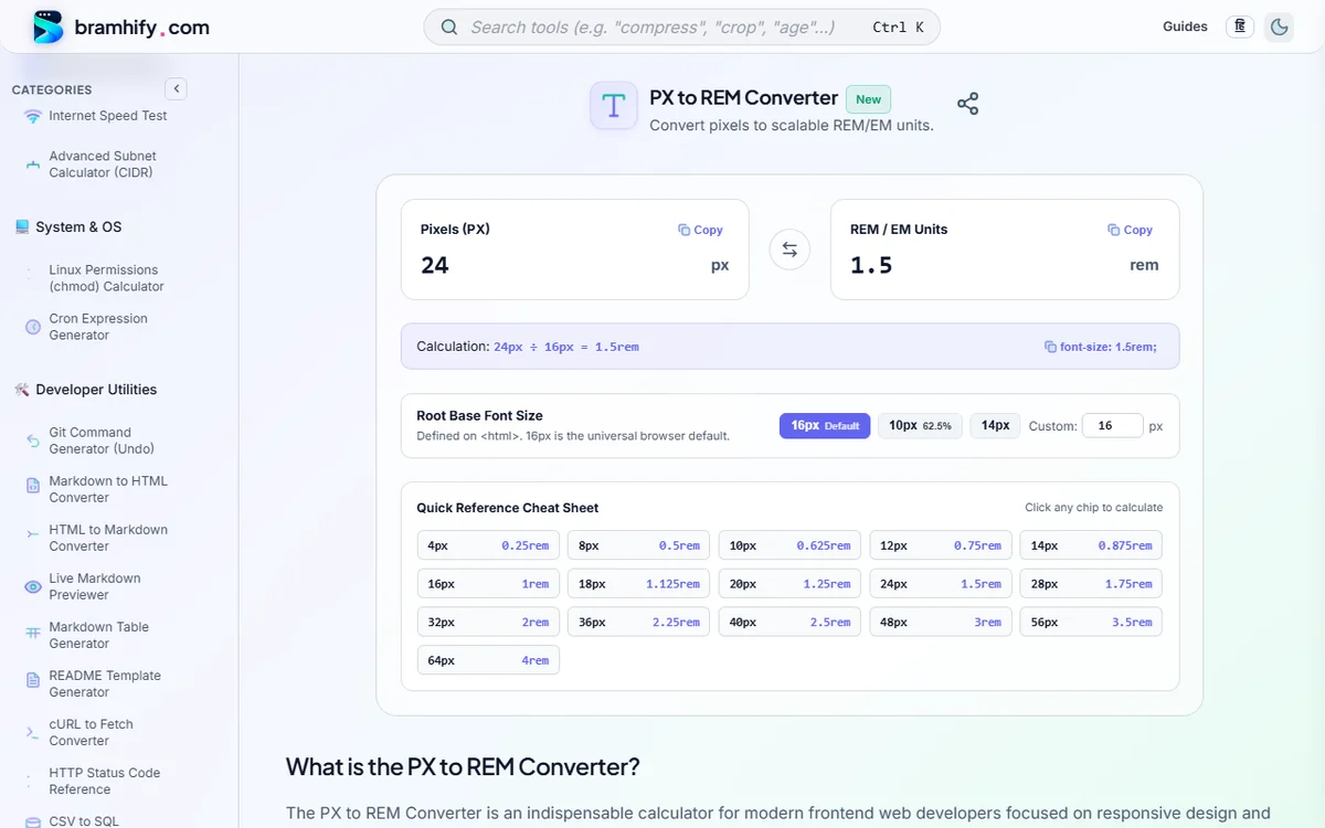
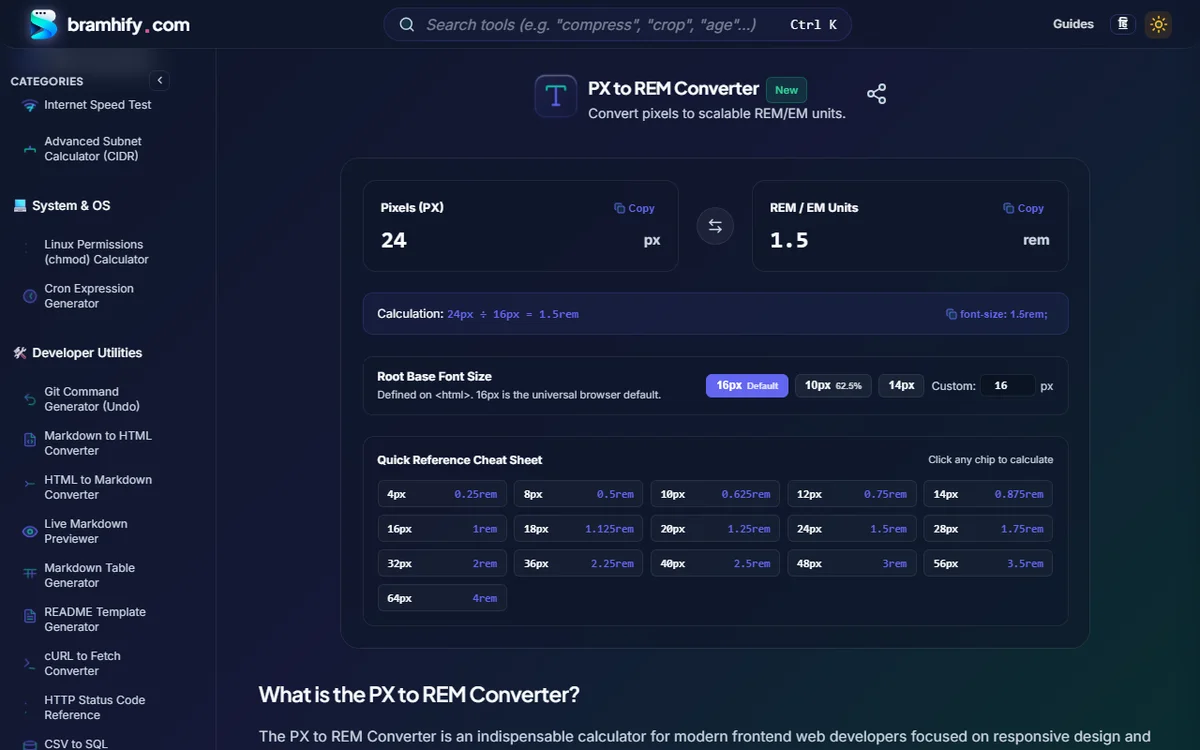
Bramhify's 100% offline PX to REM Converter offers instant bidirectional math, live formula display (24px ÷ 16px = 1.5rem), 1-click Copy CSS (font-size: 1.5rem;), preset root bases (16px Default, 10px / 62.5%, 14px, or custom), and a clickable quick-reference grid right in your browser.
Complete PX to REM Conversion Table (16px Default vs. 62.5% Trick)
Bookmark this table matching Figma pixel specs directly to Tailwind CSS / Standard 16px Root and 10px (62.5%) Root projects:
Pixels (px) | REM (16px Base — Default) | REM (10px / 62.5% Base) | Tailwind CSS Class | Common UI Role |
|---|---|---|---|---|
| 12px | 0.75rem | 1.2rem | text-xs | Captions, badges, footnotes |
| 14px | 0.875rem | 1.4rem | text-sm | Secondary UI copy, inputs, buttons |
| 16px | 1rem | 1.6rem | text-base | Standard accessible body copy |
| 18px | 1.125rem | 1.8rem | text-lg | Lead paragraphs, card titles |
| 20px | 1.25rem | 2.0rem | text-xl | Section subheadings (H3) |
| 24px | 1.5rem | 2.4rem | text-2xl | Major headings (H2 — WCAG Large Text) |
| 30px | 1.875rem | 3.0rem | text-3xl | Page titles |
| 36px | 2.25rem | 3.6rem | text-4xl | Hero titles (H1 mobile) |
| 48px | 3rem | 4.8rem | text-5xl | Hero titles (H1 desktop) |
Convert PX ↔ REM with Custom Base Presets Locally:

rem vs. em vs. px: When to Use Each CSS Unit
- Use
remfor Font Sizes, Gaps, Padding & Media Queries:remalways multiplies the root<html>font size—never compounding unpredictably inside nested lists or cards. Even better, media queries written inrem(@media (min-width: 48rem)) adapt automatically when a user zooms their default browser font size! - Use
emfor Component-Relative Padding & Icons: Settingpadding: 0.5em 1emon a button orwidth: 1em; height: 1emon an inline SVG icon means a.btn-lg(font-size: 1.25rem) automatically scales its padding and icon proportionally without extra rules. - Keep
pxOnly for Hairline Borders & Subtle Shadows:border: 1px solidandoutline-offset: 2pxshould stay crisp at1px–2pxinstead of blurring into fractional subpixels when scaled.
Should You Still Use the html { font-size: 62.5%; } Trick in 2026?
Setting html { font-size: 62.5%; } shrinks the root base from 16px down to 10px (16 × 0.625 = 10) so 24px becomes an easy mental 2.4rem while still respecting user browser zoom (unlike setting hardcoded html { font-size: 10px; }, which breaks accessibility!).
Modern Verdict:
- Avoid
62.5%if you use Tailwind CSS, Shadcn/UI, Bootstrap, or third-party component libraries—they all assume a16pxroot and will shrink to 62.5% miniature size! - Stick to default
16pxroot (1rem = 16px) and lean on Bramhify's PX to REM Converter or CSS custom properties (--text-lg: 1.125rem;).
Fluid Responsive Typography with clamp() (Zero Breakpoint Jumps)
Instead of writing three media queries to shrink an H1 from desktop to mobile, combine rem with vw inside CSS clamp(min, preferred, max):
/* Scales smoothly from 1.75rem (28px) on mobile to 3rem (48px) on desktop */
h1 {
  font-size: clamp(1.75rem, 1.2rem + 2.5vw, 3rem);
  line-height: 1.15;
}
Accessibility Rule (WCAG 1.4.4): Always include a
remcomponent (1.2rem + 2.5vw) inside the middleclamp()argument—never pure5vwalone—so users can still zoom text to 200% cleanly usingCtrl +!
Frequently Asked Questions (FAQs)
Why do accessibility experts recommend rem over px for font-size?
Hardcoded px font sizes ignore a user's browser-level default font size setting (common among low-vision users who change Chrome/Firefox from 16px to 24px). Using rem respects that root preference automatically so every heading, paragraph, and layout rhythm scales harmoniously.
How do I convert pixels to rem manually?
Divide the pixel value by the root <html> font size (almost always 16px): rem = px ÷ 16. For example, 20px ÷ 16 = 1.25rem, and 14px ÷ 16 = 0.875rem.
Does html { font-size: 10px; } break accessibility?
Yes! Hardcoding 10px on <html> overrides the user's custom browser font size completely. If you want a 10px base for mental math, you must use a percentage (html { font-size: 62.5%; }) and immediately restore body { font-size: 1.6rem; }.
What is the difference between em and rem?
rem ("root em") is always relative to the root <html> element (16px), so 1.5rem means 24px everywhere on the page. em is relative to the parent element's font size—which can accidentally compound (1.2em inside 1.2em becomes 1.44×) in nested lists or cards.
Building a complete accessible CSS token system?
Pair this calculator with our WCAG Color Contrast Cheat Sheet and Modern Glassmorphism & CSS Box Shadow Recipes.