


Look closely at any polished SaaS dashboard (Stripe, Linear, Vercel, Apple macOS) and compare it with a generic template. The difference rarely comes from complex 3D WebGL—it comes from soft, physically plausible layered box-shadow elevation, crisp 1px specular borders, and subtle gradient + frosted backdrop-filter glassmorphism that works effortlessly in both Light and Dark themes.
Bramhify's 100% offline CSS Box Shadow Generator and CSS Gradient Builder let you dial in X/Y offsets, blur, spread, inset mode, light/dark/grid preview canvases, and custom linear or radial gradient angles visually—with 1-click Copy CSS and zero server round-trips.
Anatomy of a Clean box-shadow Rule
/* box-shadow: [inset] offset-x offset-y blur-radius spread-radius color; */
box-shadow: 0px 10px 25px -5px rgba(15, 23, 42, 0.12);
- Negative
spread-radius(-4pxto-8px): The #1 secret of designer-grade shadows! Pulling the spread slightly negative tightens the shadow beneath the card so it looks gently lifted instead of muddy around the side edges. - Tinted Shadows Over Pure Black: Instead of harsh
rgba(0, 0, 0, 0.35), tint shadows with deep slate (rgba(15, 23, 42, 0.12)) or your card's primary brand hue (rgba(79, 70, 229, 0.25)) for natural color harmony.
Design & Preview Box Shadows on Light, Dark & Grid Canvases:
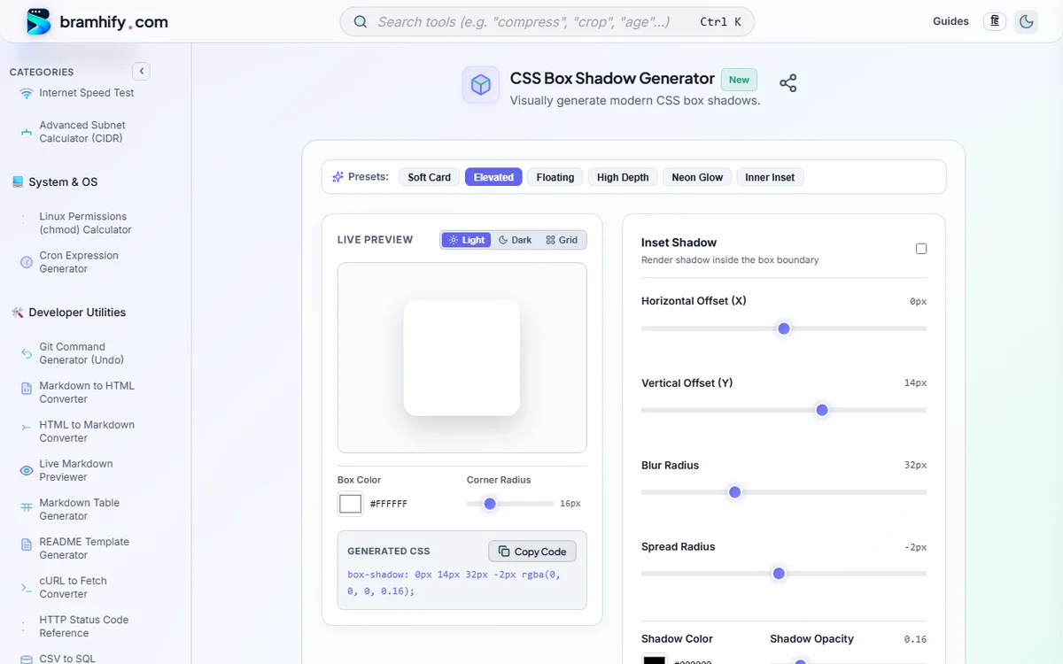
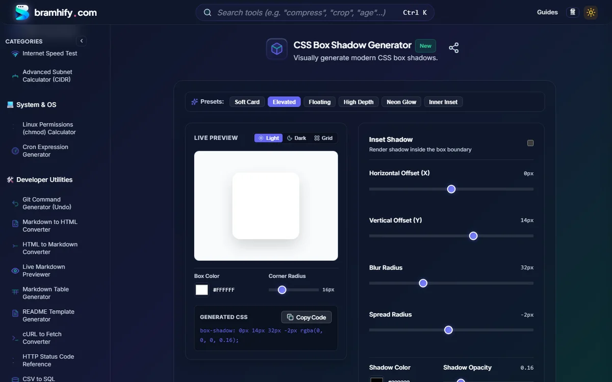

5 Copy-Paste Production CSS Elevation & Glassmorphism Recipes
1. Layered SaaS Card Elevation (Realistic Dual-Shadow)
Combining a tight ambient key shadow (1–2px) with a wider diffuse bounce shadow creates smooth depth without muddy grey halos:
.card-elevated {
  background: #ffffff;
  border: 1px solid rgba(15, 23, 42, 0.08);
  border-radius: 16px;
  box-shadow:
    0 1px 2px rgba(15, 23, 42, 0.06),
    0 12px 28px -6px rgba(15, 23, 42, 0.12);
}
2. Frosted Glassmorphism Panel (Light & Dark Mode Ready)
True glassmorphism relies on four coordinated properties: low-opacity fill, backdrop-filter: blur(), a crisp 1px semi-transparent highlight border, and a soft ambient shadow:
/* Dark Mode Frosted Glass */
.glass-card-dark {
  background: rgba(15, 23, 42, 0.58);
  backdrop-filter: blur(16px) saturate(140%);
  -webkit-backdrop-filter: blur(16px) saturate(140%);
  border: 1px solid rgba(255, 255, 255, 0.12);
  border-radius: 16px;
  box-shadow: 0 20px 45px -12px rgba(0, 0, 0, 0.45);
}

/* Light Mode Frosted Glass */
.glass-card-light {
  background: rgba(255, 255, 255, 0.72);
  backdrop-filter: blur(16px) saturate(160%);
  -webkit-backdrop-filter: blur(16px) saturate(160%);
  border: 1px solid rgba(15, 23, 42, 0.08);
  border-radius: 16px;
  box-shadow: 0 12px 32px -8px rgba(15, 23, 42, 0.1);
}
3. Vibrant Gradient CTA Button + Colored Glow Shadow
Pair Bramhify's CSS Gradient Builder with a matching indigo glow shadow:
.btn-gradient-glow {
  background-image: linear-gradient(135deg, #4f46e5 0%, #7c3aed 100%);
  color: #ffffff;
  border-radius: 12px;
  box-shadow: 0 10px 24px -6px rgba(79, 70, 229, 0.45);
}
4. Subtle Dark-Mode Top Specular Edge (inset)
Drop shadows almost vanish against #0f172a dark backgrounds! Use a 1px top inset highlight to separate elevated modals and drawers in Dark Mode:
.modal-dark {
  background: #1e293b;
  border: 1px solid rgba(255, 255, 255, 0.08);
  box-shadow:
    inset 0 1px 0 rgba(255, 255, 255, 0.12),
    0 24px 60px rgba(0, 0, 0, 0.55);
}
5. Performance-Safe Hover Lift (Zero Paint Jank)
Animating box-shadow directly on :hover triggers full browser repaints on every frame. Instead, animate transform and opacity on a pre-painted pseudo-element—or keep transitions short (180ms ease) with transform: translateY(-2px)!
Glassmorphism Performance & Accessibility Checklist
| Check | Safe Rule | Why |
|---|---|---|
| Blur Radius Cap | Stay between 10px and 20px | Huge blur(60px) filters cause GPU frame drops during mobile Chrome scroll |
| Safari Prefix | Always include -webkit-backdrop-filter | Required alongside standard backdrop-filter for older iOS WebKit |
| Text Contrast Over Glass | Minimum 4.5:1 WCAG AA ratio | Translucent cards over busy backgrounds fail contrast unless alpha >= 0.65 |
| Dark Mode Separation | Add 1px solid rgba(255,255,255,0.1) | Pure black shadows disappear on dark surfaces without a hairline border |
Frequently Asked Questions (FAQs)
Why do my box-shadow styles disappear in Dark Mode?
Dark shadows (rgba(0, 0, 0, 0.15)) have almost zero luminance contrast against a #0f172a or #111827 surface. In Dark Mode, define hierarchy with slightly lighter surface colors, 1px translucent borders (rgba(255, 255, 255, 0.08)), and a 1px top inset highlight.
What is the difference between box-shadow and filter: drop-shadow()?
box-shadow follows the rectangular CSS border box (including border-radius) and supports spread-radius and inset. filter: drop-shadow() follows the actual alpha transparency contour of transparent PNGs and SVGs (perfect for cutout icons), but does not support spread or inset.
Does backdrop-filter: blur() hurt Core Web Vitals or mobile scrolling?
Used sparingly on headers, modals, and 1–2 focal cards (blur(12px–16px)), it runs smoothly at 60fps on modern GPUs. Avoid putting backdrop-filter on 30+ scrolling list items simultaneously, which can overwhelm mid-tier mobile GPUs.
How can I build linear and radial gradients visually alongside shadows?
Open Bramhify's companion CSS Gradient Builder to pick two colors, switch between Linear (0°–360°) and Radial modes, swap stops in 1 click, and copy the exact background-image CSS rule offline.
Want to verify your glassmorphic card passes WCAG AA text contrast?
Run your card's text and background colors through our WCAG Color Contrast Cheat Sheet & Checker and size your spacing cleanly with our PX to REM Conversion Guide.